 I should be on the log-scale
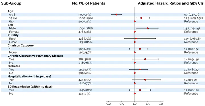
In a previous role, creating forest plots were a routine task in almost any project that involved studying statistical associations between various exposures and outcomes using population-level data. These usually came in the form of logistic regression (odds ratios) or Cox models (hazard ratios) and needed to be visualized, often using a forest plot.
While that role (and organization) was very SAS-centric, no macro or PROC, to my knowledge, existed at the time that made this process painless. Often analysts would turn to Excel (cringe) and spend needless hours trying to format shoehorn their results into a template.
To help overcome this, I created a forest plot in R and shared it with colleagues. As more and more wished to use it and adapt it, I realized this was a good candidate for a Shiny app. So, regardless of familiarity with R, all project members could craft a high-quality, publication ready forest plot for the journal article submission.
To help bridge the gap between SAS and R, I structured the input data set required by the shiny app around what PROC logistic or Lifetest would spit out via ODS (or something very near). This was also because at the time, most statistical analyses were not done in R.
So, the app works like this.
- I provide you a template with some light conventions to follow. These mimic most SAS PROCS ODS outputs.
- Fill in the template and upload it to the app.
- I provide you a good deal of aesthetic control (color, log-scaling, custom breaks, text, etc) to customize your plot.
- Download your plot as a high-res PDF.
- ???
- Profit.
There’s sample data in the app. You can edit it to your liking or just click Proceed. Give it a shot.