Time Machine
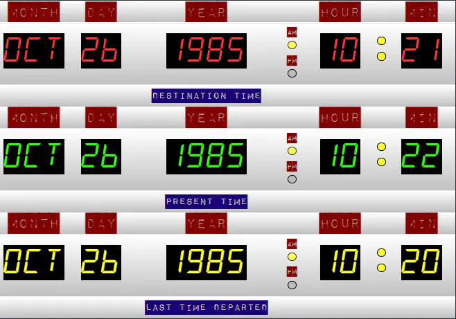
 Time Machine (static, non-animated)
Overview
This is another entry into the ⚡R Studio 2022 Table Contest. It uses reactable, countup and css to recreate the time machine gizmo seen in the movie Back To The Future
My aims for this project were two-fold:
-
To think about creative uses of tables! ✅
-
Continue to experiment with reactable, css and Quarto. ✅
Approach
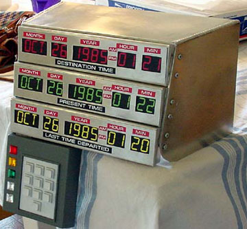
My goal was to reenvision the following image as a table using R.

I can divide my approach into 2 sections: general and styling
General
When I first saw the above image, I thought it would make a great use-case for getting creative with tables. It was immediately apparent that the bulk of this work was going to boil down to styling. The general approach is quite simple:
- Create a data frame with the required data
data <- tibble::tribble(
  ~MONTH, ~DAY, ~YEAR, ~AMPM, ~HOUR, ~COLON, ~MIN,
   "OCT",   26,  1985,    NA,    10,     NA,   21,
   "OCT",   26,  1985,    NA,    10,     NA,   22,
   "OCT",   26,  1985,    NA,    10,     NA,   20
  )
The AMPM and COLON columns are left as placeholders which get rendered in reactable.
- Execute 3 successive calls to a custom
reactablefunction, one for each row of the table. E.g.
data %>%
  filter(row_number() == 1) %>%
  my_reactable()

# etc
my_reactable() is a wrapper that is written by me and takes care of the formatting of a single table row including the cell, column and footer rendering along with css. A great use-case for a function! 🎯
Styling
Much of my effort in this table was around styling. This involved quite a bit of work and playing around, and in the end I’m glad I saw it through to completion. 😥 ➡ 🤓
CSS
Yes, much of this table relies on custom css classes. It shouldn’t be taken for granted the amount of work needed however, including research on the following to match aesthetics:
- custom fonts, font sizes, color schemes
- using new html elements (i.e.
<mark></mark>) - animations with css
- leveraging the
@extenddirective to make my css file shorter and more compact 💥💥💥
Countup
One neat package I was finally thrilled to have a use for was the countup by John Coene. In short, his package lets you transform the appearance of a number as if a counter were running as an html element. This integrated quite nicely with reactable and serves to give the illusion that the time machine is calibrating! 😵
3D
I also spent a bit of time learning some additional methods of css, namely perspective, skew, scale and transform. I decided to integrate this into this work as well as a separate table. 📦 This image was my inspiration:

Forward
You can view these tables and all their interactive glory here
🍻✌ Till next time!