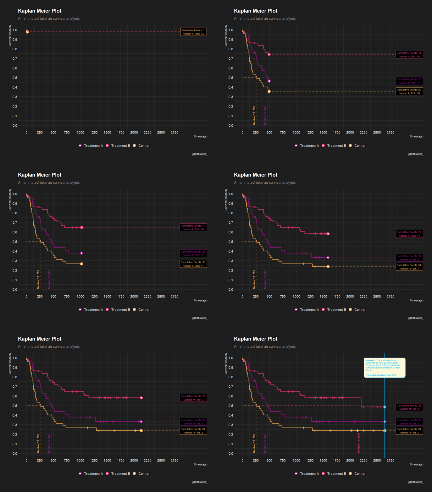
This was a neat experiment using the {gganimate} package for storytelling purposes. In the Kaplan-Meier plot, animation serves as the vehicle to unravel chronological events in a fictitious Oncology clinical trial.
Some features include: + Animation of the individual survival curves over time - here you can see how fast the probability of survival drops quite clearly.
Tracking of number of events and number at risk in real time.
The use of stopping points to emphasize when the median survival time is achieved
The use of stopping points to emphasize contextual information such as planned analyses dates and results of interim stats. Note: may or may not make actual sense given the data.
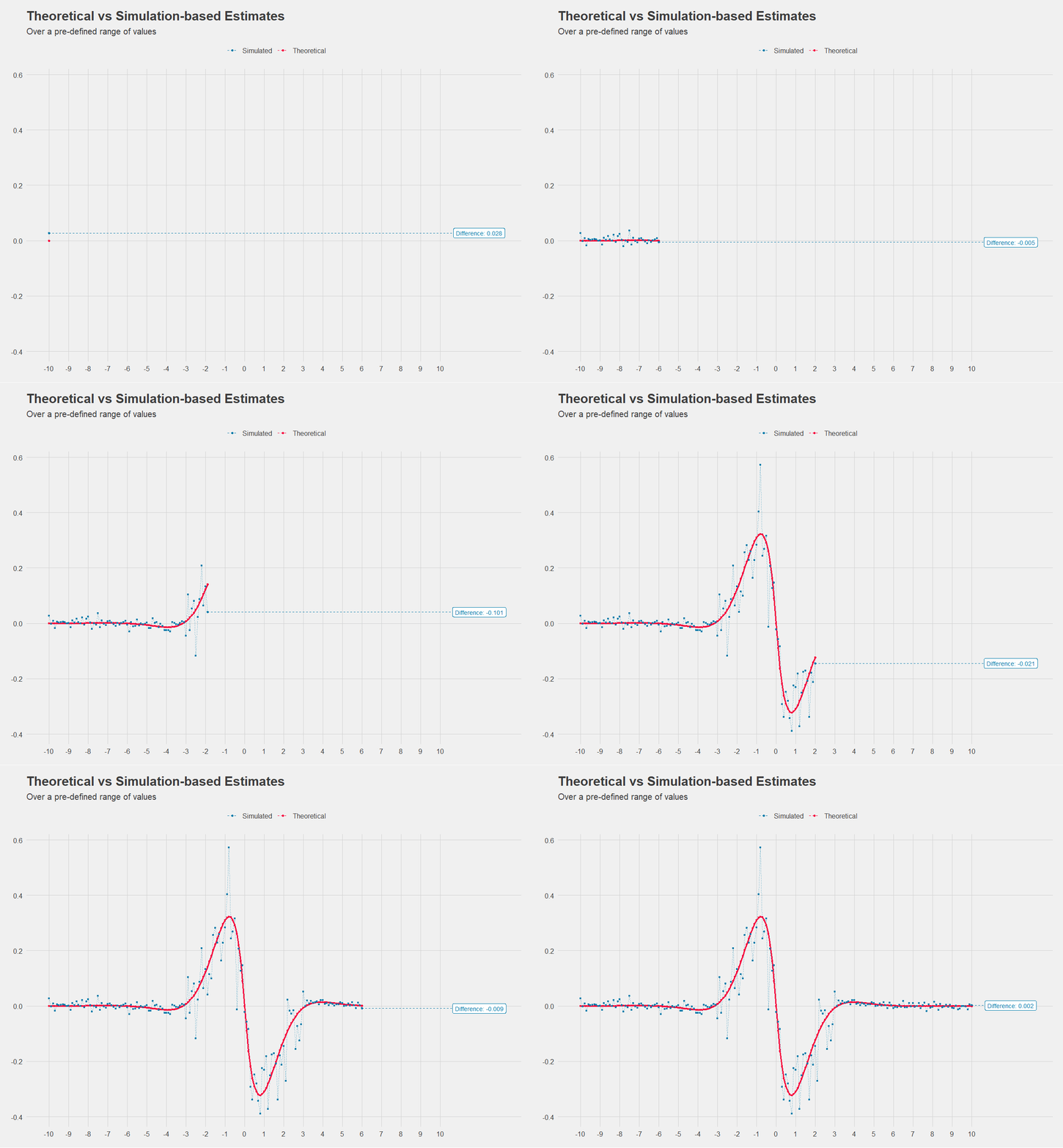
I also had a bit of fun to see where else this could potentially play a role. In the below graph, we compare theoretical versus observed values from a simulation study to see where across the axes the biggest differences lie.
This was experiment sparked further discussion into how we can help our Stat colleagues during their round-table discussions. It was eventually spun off into a shiny app.
Good times.