Dynamic TLFs
 A linked TLF
Overview
This is another entry into the ⚡R Studio 2022 Table Contest. This app enables the exploration of subgroups on-the-fly through linked, interactive tables, listings and figures (TLFs) for clinical trial data. It leverages Tplyr, reactable and reactablefmtr for computing and is presented as a dashboard using Quarto.
My aims for this project were two-fold:
- Investigate whether we can dynamically create tables which can be used to guide an exploratory analysis.
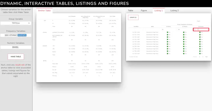
The analysis starts with an anchor table, where individual cells can be clicked to retrieve the study participants ID’s who comprise it. These are subsequently fed into additional tables, listings and figures through reactives.
In previous work, I’ve hard coded the anchor table by pre-specifying the variables to be displayed. With this work, you can now dynamically specify the anchor table to include any variables you like, which in turn can be used explore subgroups on-the-fly.
This work is largely enabled by utilizing the metadata building features of the Tplyr 📦.
- Currently, no dashboard extension or package exists for Quarto. I used this opportunity to also see if I could (roughly) mimic what flexdashboard offers by using Quarto and custom css. My inspiration was the bootswatch lux theme. 👀
Approach
The linked TLFs are also interactive and share the spirit of “drilling down” 🔃
Adverse Events Table 🕵
- Uses reactable’s groupBy to succinctly present a large table
- Cells (in the second column) are hyper-linked to open a MedlinePlus search of that term. I found this resource was helpful in learning about medical conditions when analyzing clinical trials data.
- A table-wide search functionality to pin-point certain SOCs/PTs of interest
- A button to expand all SOCs at once to show the nested PTs
Adverse Event Figure 📊
- The highcharter column chart is a drill down plot. The first layer displays the top 4 System Organ Classes for a given subset
- Clicking each of bars lets you drill down into a stacked column chart for the Preferred Terms x Severity
- Customized tool tips to display information more clearly (i.e. severity of adverse event)
Patient Listing 1 📝
- Uses reactable’s filter + search to navigate a potentially exhaustive table
- Leverages reactable’s columnGroups + formatting to organize the data layout
- Capable of exporting a list subject identifiers as a CSV file to enable further analyses of interesting subgroups
Patient Listing 2 📋
- Uses reactablefmtr’s inline visual to show vital signs measured at three times relative to baseline (i.e. percent change)
- Leverages reactable’s columnGroups + formatting to organize the data layout
- Paired with shiny inputs to enable switching of Blood Pressure Parameters and Visits
Future
This app can be extended in a number of different ways:
- Including additional, linked TLFs; the sky’s the limit! 🤩
- Uploading data - the way I’ve began to structure the server will enable this in the future ⏫
- More robust organization, control and validation for when the anchor table is updated 🛠
Till next time, 🍻!